 My final piece of double page research is from the ETC lifestyle magazine, featuring a band called ' The Hours'. The main colour scheme is black and white with some red font. The left hand third is occupied by the title and the article description, as well as an image that represents the band, as the image is of clocks, this ties in with the name 'The Hours', this section has a black background which defines it from the rest of the article. The actual article is different from the title section as it has a white background with black font. Through the middle of the page is an image which splits the article and defines the main part of the page. I like this design because although it is very simple, it is also very effective.
Wednesday, 19 November 2008
Double Page Spread Research 2 - ETC Magazine
My final piece of double page research is from the ETC lifestyle magazine, featuring a band called ' The Hours'. The main colour scheme is black and white with some red font. The left hand third is occupied by the title and the article description, as well as an image that represents the band, as the image is of clocks, this ties in with the name 'The Hours', this section has a black background which defines it from the rest of the article. The actual article is different from the title section as it has a white background with black font. Through the middle of the page is an image which splits the article and defines the main part of the page. I like this design because although it is very simple, it is also very effective.
Double Page Spread Research 1 - Kerrang! Magazine
 My first double page spread analysis is on Kerrang! magazine. The layout consists of a main picture, that occupies just over half of the A3 sized page. The main title of the page is also on the left hand side, as it overlays the main image. The main article is written on the right hand side of the page using a black background with white writing, this gives the effect of darkness and contrasts from everyday blakc writing on a white background.
Various pictures which are different sizes are scattered around the main article from the video set, which is the reason for the article. In the top right hand corner of the article is a quote from a band member which gives a vague idea of the article and makes the reader want to carry on reading.
Contents Page Research 2 - Drummer Magazine
 My second contents page analysis is from the Drummer magazine. The layout is very similar to the previous contents page that I analysed, with a similar colour scheme and the contents down the left hand side with images occupying the rest of the page. The title is very vibrant at the top of the page in bold, black font, which stands out in the busy layout. Once again, all images are accompanied by a page number to make it easier to find the required page in the magazine. In a red box in the top left hand corner of the page is the month and year that the issue was produced. In the bottom left corner is another red box with the regular pages that are always featured in the magazine. As in the previous research, the page numbers are listed in red, with the page title in a bold black font, and the page description in the same font, but this time not in bold.
Tuesday, 18 November 2008
Contents Page Research 1 - Big Cheese Magazine
 The first contents page analysis I will be conducting is on the Big Cheese magazine, which is a magazine that features punk rock/ alternative music. The layout is very simple for this magazine, with a simple white background, with multiple images set out around the page. On the left hand side, the contents are set out with firstly a page number, in black. The name of the band is the next to the number in a red font, and finally the page description is in black font. This style of layout puts emphasis on the band name, making finding the page you want alot easier. The rest of the page is scattered with images of the artists featured in the magazine, accompanied with a page number, once again making the desired page easy to find.
Research 3 - Rolling Stone Magazine
 My final front cover analysis is on the Rolling Stone magazine.
This magazine seems more elaborate and well thought out compared to the other to, as it has more prestige and has been along for longer. The classic colour scheme is red and white, similar to NME magazine. The title font contains an element of each colour mentioned in the scheme, and is in a classic, italic font that has been used since the magazine started. Other titles are in an uppercase serif font to catch the readers' eye, as well as being in a bold font type. The title descriptions are in a lowercase serif font, this shows sophistication in comparison to sans serif fonts. The layout consists of a main title, numerous other titles and a single image as the background. The image is a medium close-up shot of a band, which overlays the title to emphasise that the picture is in front of the title.
Research 2 - NME Magazine
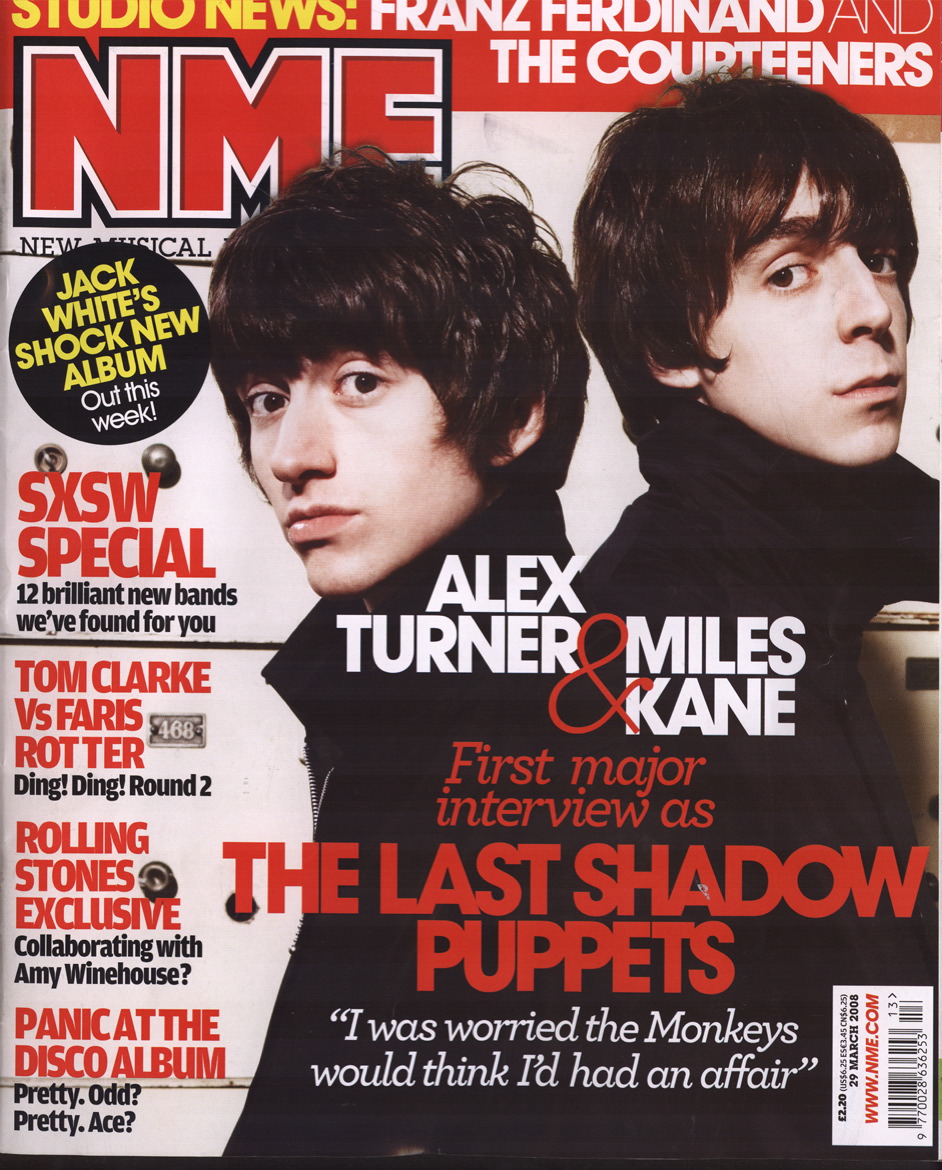 My second cover to analyse is the popular music magazine NME. This cover is busier than the previous Kerrang! magazine but is still very well presented. The colour scheme used for this magazine is black, white and red, which is the signature colours for this magazine. All titles are in an upper-case, solid font, with all taglines being in a lowercase, smaller font. There is only one image used on this magazine, which prevents reader attention from being diverted away from the main section of the magazine. As the picture is of a darker nature, using lots of black, any font used on the picture is either red or white, these colours stand out well on the black background and are easy to read. The left hand section of the cover contains information on what else is inside the magazine besides the main article, as does the top section, which is white on red, so that it can still be noticed and although it is behind the main image, it is still fully legible, as is the main title, that is red and surrounded by a white border, which allows it to be recognised as the title.
The main image consists of a mid-angle shot of a band, with both members wearing dark clothing, this is because the band is called 'The Last Shadow Puppets', this ties in well with this name as it potrays darkness, and therefore, shadows.
Research 1 - Kerrang Magazine

My first cover analysis is on the cover of the Kerrang! music magazine. The cover uses only three pictures and has a simple layout. The colour scheme used for the magazine is black, white and orange, these colours contrast and make the cover eye-catching and aesthetically pleasing. All font that is used, apart from the tagline, is in upper-case, white font. This portrays loudness and shows what the magazine is about. The header is showing the songs featured on a free CD that is included with the magazine, with the band names in white, uppercase font seperated with orange stars, which ties in with the colour scheme of the magazine. The main image is a medium close-up of a band member eating an ice cream, this is done as the tagline of the title is 'life is sweet!'. The font on the main picture has a shadow, which means that the font is easily readable over the picture. The main image overlays the title of the magazine, givin the impression that the model is in front of the title.
The title itsself uses a busy font resembling broken glass. The colours used are white on a black background, this is used as it makes the font stick out on the page as opposed to black on white, which can sometimes look dull and unattractive. In the bottom left-hand corner, the front cover of the CD is used, above this image is white font with an orane background, this fits in with the colour scheme as well as stands out from the rest of the titles. The final picture which is above the CD cover, is a preview of one of the free posters that are featured inside of the magazine, showing a close up shot of a female band member. Finally, in the bottom-right corner of the cover is the names of bands featured inside of the magazine, once again using the uppercase white font.
Subscribe to:
Comments (Atom)
