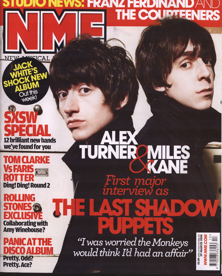
 My second cover to analyse is the popular music magazine NME. This cover is busier than the previous Kerrang! magazine but is still very well presented. The colour scheme used for this magazine is black, white and red, which is the signature colours for this magazine. All titles are in an upper-case, solid font, with all taglines being in a lowercase, smaller font. There is only one image used on this magazine, which prevents reader attention from being diverted away from the main section of the magazine. As the picture is of a darker nature, using lots of black, any font used on the picture is either red or white, these colours stand out well on the black background and are easy to read. The left hand section of the cover contains information on what else is inside the magazine besides the main article, as does the top section, which is white on red, so that it can still be noticed and although it is behind the main image, it is still fully legible, as is the main title, that is red and surrounded by a white border, which allows it to be recognised as the title.
The main image consists of a mid-angle shot of a band, with both members wearing dark clothing, this is because the band is called 'The Last Shadow Puppets', this ties in well with this name as it potrays darkness, and therefore, shadows.

No comments:
Post a Comment